Navigating Success: How Clout Consult Crafted Coffice’s Brand Identity
In the bustling world of entrepreneurship and freelancing, finding the right direction can be challenging. That’s where Coffice comes in – a unique blend of coworking and office space designed to empower emerging talents and ignite creativity. But what truly sets Coffice apart is its distinct branding, carefully crafted by the experts at Clout Consult.
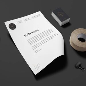
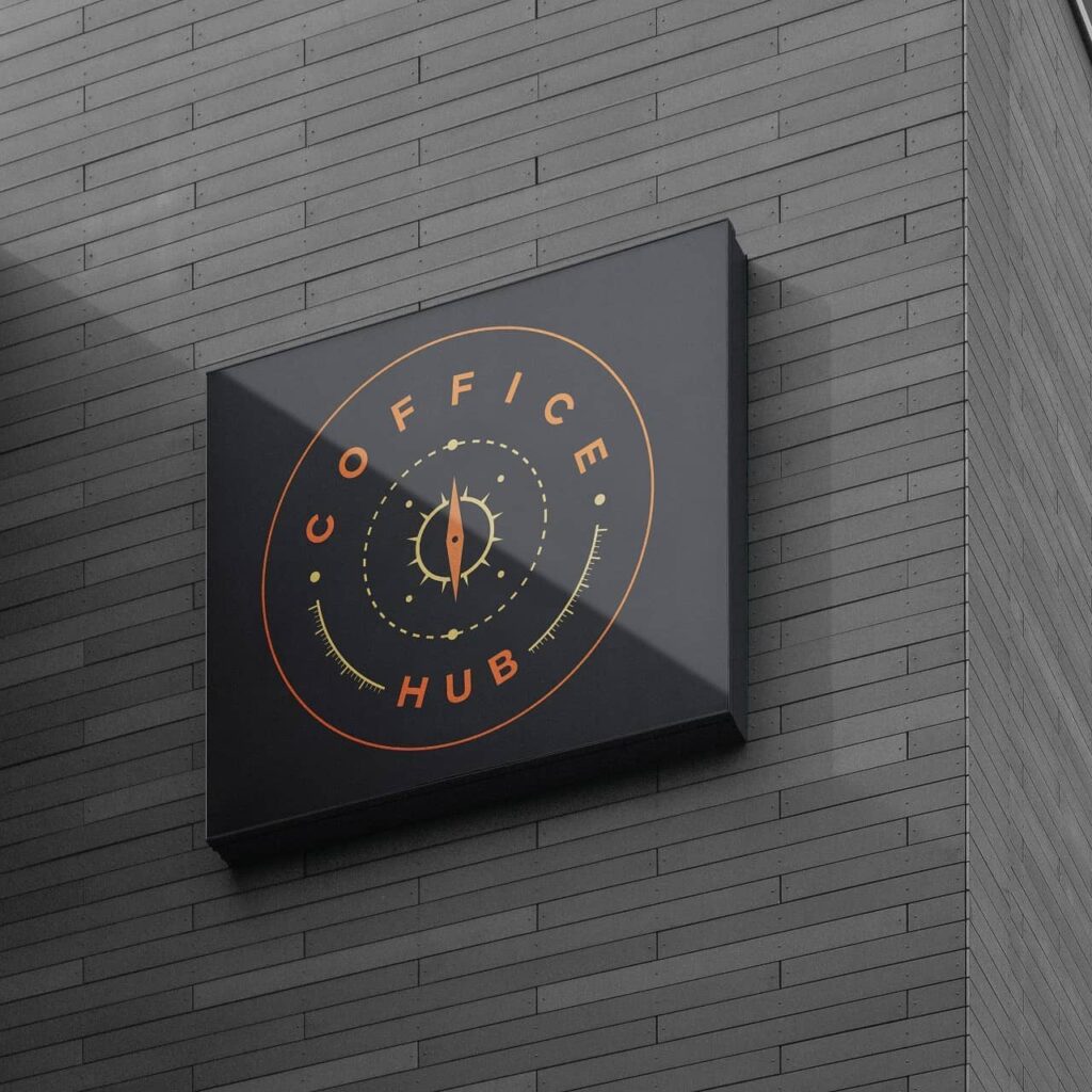
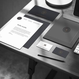
At the heart of Coffice’s brand identity lies its logo – a symbol of positivity, direction, and growth. The compass, prominently featured in the design, serves as a beacon of guidance, pointing towards success and paving the way for aspiring entrepreneurs. It’s a visual representation of Coffice’s mission to support and nurture the dreams of its community members.
But the logo is more than just a graphic – it’s a reflection of Coffice’s commitment to its environment. The vibrant yellow dots surrounding the compass represent the sand and the natural surroundings of Coffice’s beachside location. They serve as a reminder of the tranquil setting where minds can roam freely and ideas can flourish.
As a branding and marketing agency, Clout Consult understood the importance of capturing Coffice’s essence in its visual identity. By incorporating elements of direction, growth, and environment, the logo embodies the spirit of Coffice and resonates with its target audience.

In the competitive landscape of coworking spaces, branding plays a crucial role in attracting and retaining members. With Clout Consult’s expertise, Coffice has not only established a strong visual identity but also created a compelling narrative that sets it apart from the crowd.
At Coffice, success isn’t just a destination – it’s a journey, and the branding journey with Clout Consult has set the course for a bright and prosperous future.